I love crafting with monograms and names. Maybe it’s because my name is relatively rare, and growing up I never found my name on a gift shop souvenir. Now, I’m constantly putting “Kriselle” or “KL” on everything I can put a decal on.
Crafting with monograms and names is one of the best ways to get started for new Cricut users. I’ve always felt like the hardest thing about crafting is just deciding what to make. When you start with a monogram or name, the design is pretty much taken care of for you — you just need to decide what font to use and where to put it.
If you’re thinking about crafting some personalized items, here are some tips to keep in mind.
Order of letters
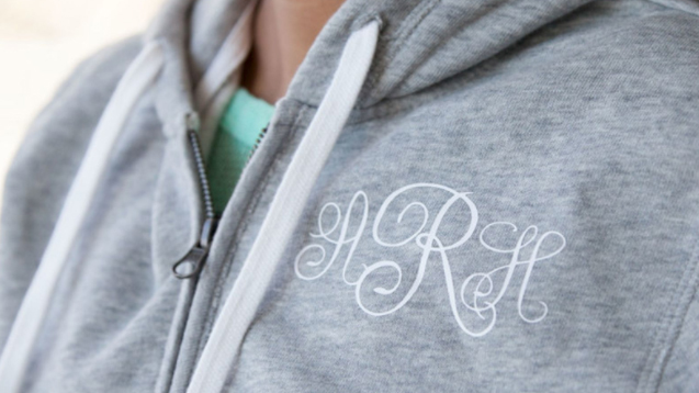
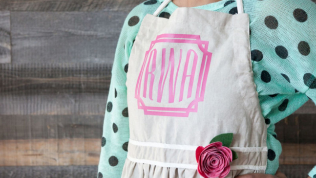
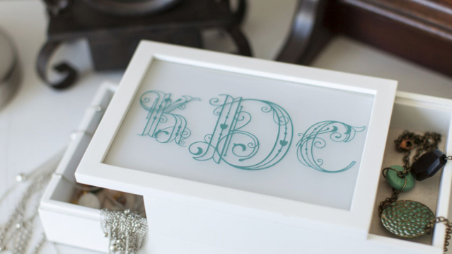
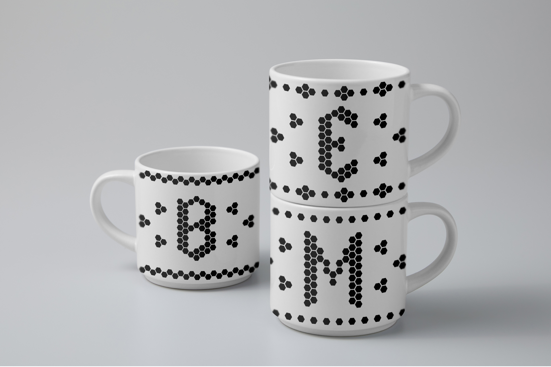
There are two main types of monograms: one where all the letters are the same size, and the other where the middle letter is larger than the first and third. What’s the difference? The order of the letters.
In the design where all letters are the same size, the initials are ordered by first name, middle, and then last name.
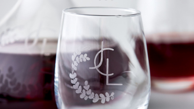
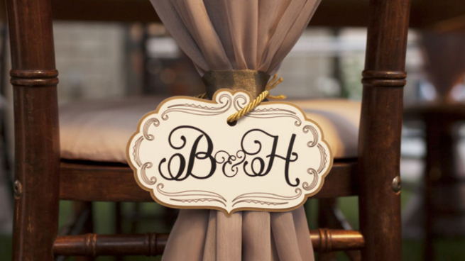
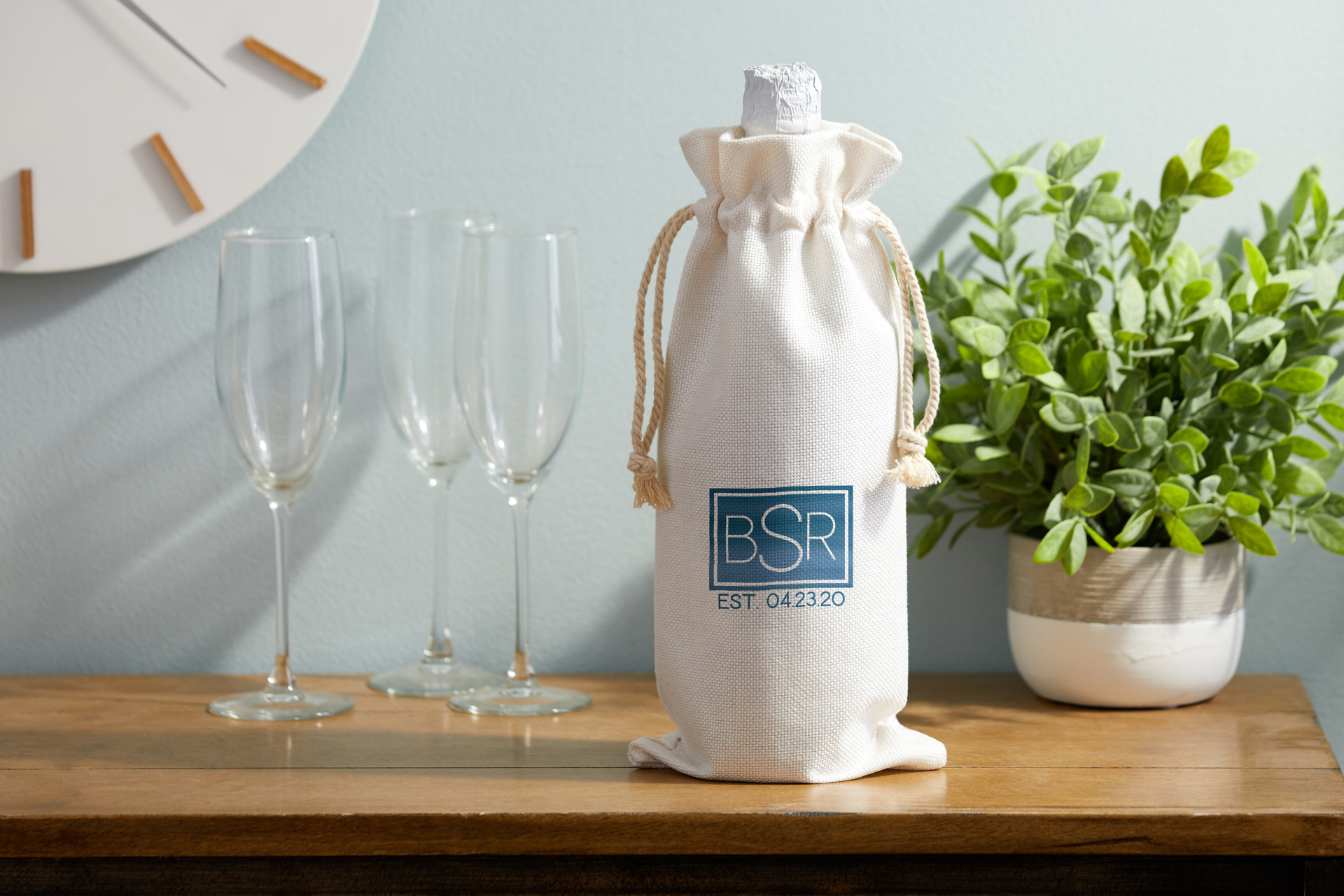
Designs with a larger middle letter are organized differently. Instead, they go in the order of first initial, last initial, and then middle. This type of design can also be easily used for couples. For example, my spouse’s name starts with a J, so this design would accommodate our last initial in the center with each of our first initials on either side.
Font choice
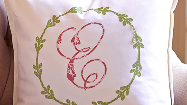
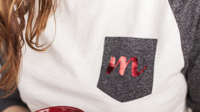
Choosing what font to use for your name is a really personal decision. Because this design represents a unique person, the font needs to reflect the personality also. My own style is all about simplicity. My home and belongings often have clean lines and lots of open space with bits of things that stick out. When it comes to fonts, this translates to sans-serif fonts, often in ultra-thin or ultra-bold thickness.
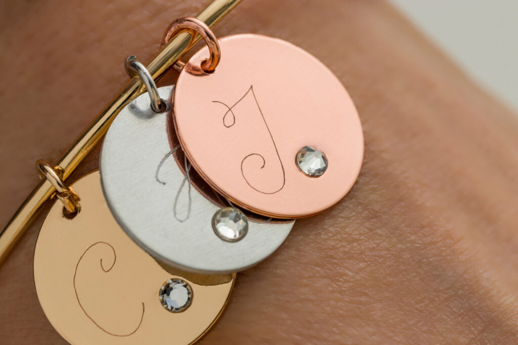
Some of my best friends like more decorative things. When I make gifts for them, I’ll often look at script and cursive fonts or font styles that resemble handwriting.
Combining names with initials
Popular trends over the past year include placing a name in the middle or in combination with a set of initials. In Cricut Design Space, this is achieved by cutting out a portion of the background letters to leave space for the name. This process of cutting out the background is called “slicing.” With this type of design, it’s a common practice to use multiple fonts. This helps create an emphasis on the spelled out name and differentiate it from the initials in the background.
However, using the same font for both a name and the initials is a complete design on its own. If you’re like me and use the sans-serif fonts, for example, I will almost always find ways to create a design that I think takes advantage of the same fonts for both rather than mixing and matching.
Something else I like to do is also make sure that the length of the name matches the width of the initials, or is aligned in a way that creates balance. For example, if I use the initials “KL” as the big part of my design, I’ll make sure that “Kriselle” is in a smaller size, but large enough to extend to the full width of the K and L. Since I also usually use block letters anyway, this type of alignment fits my style and preferred look.

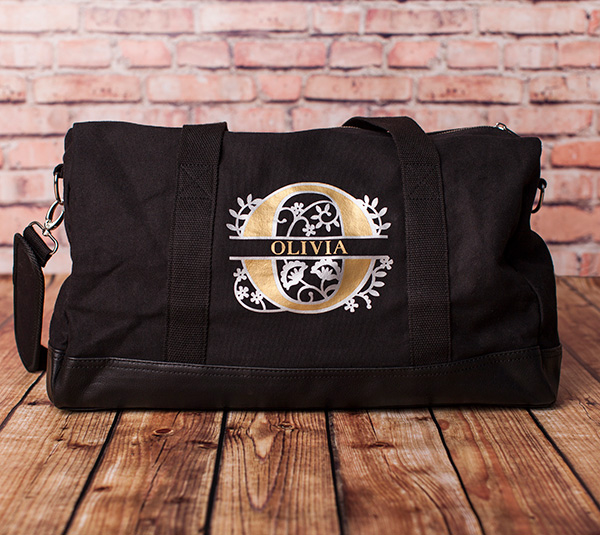
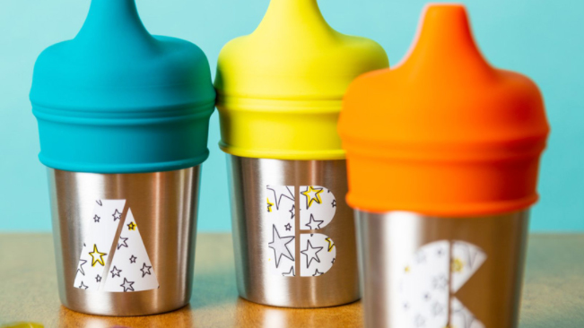
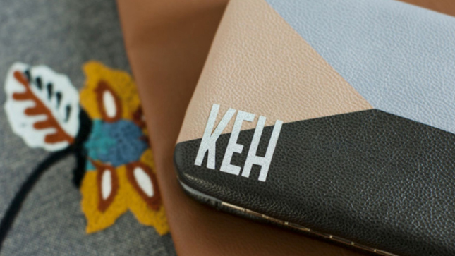
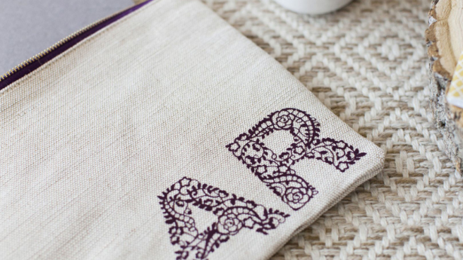
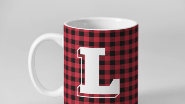
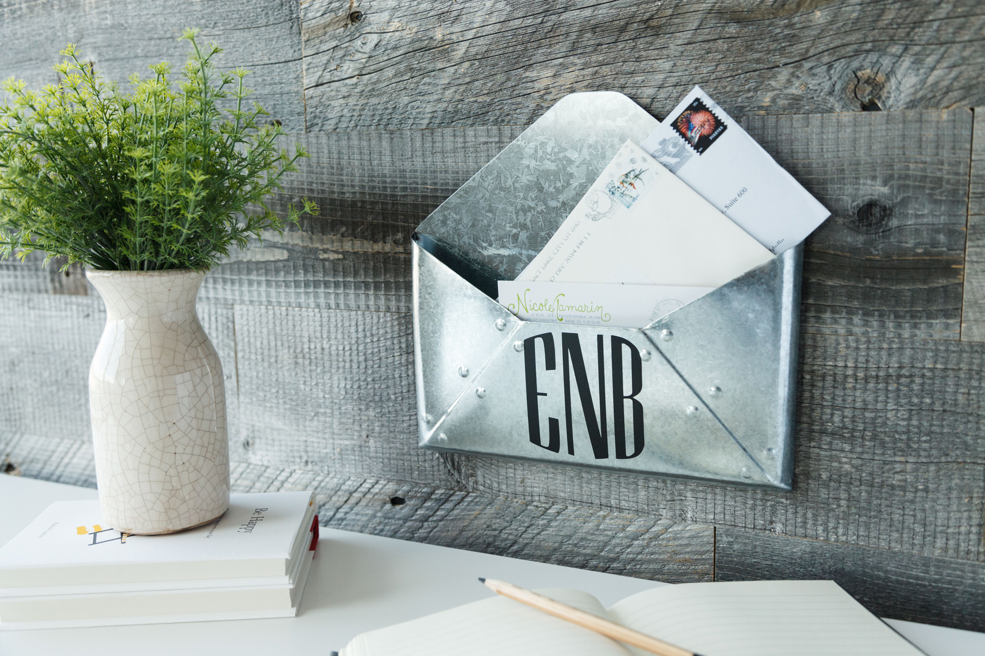
What to monogram
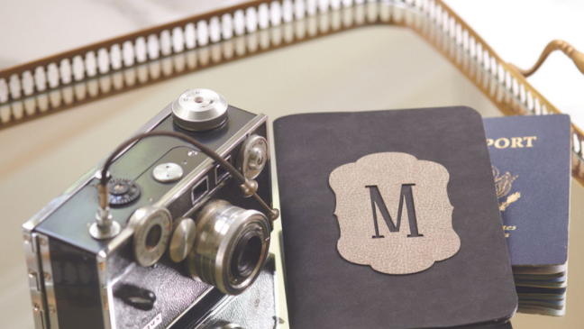
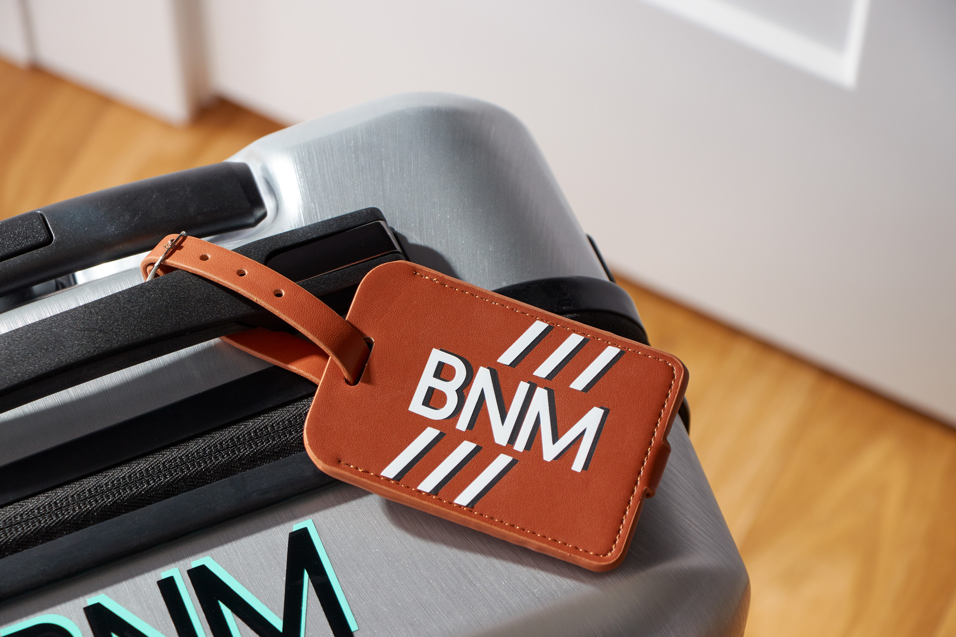
Monograms, initials, and names can go on literally almost anything. My initials are on my phone case, laptop, notebook, and face mask bag. I’ve added my family last name to water bottles, backpacks, dinner napkins — pretty much anything I can get my hands on, really.
Cricut Design Space has nearly 100 ready-to-make projects for monograms, including centerpieces, accessories, mugs, and home decor. Check this image gallery below for more examples of what to craft with monograms!